OVERVIEW
Stüssy brought me in as an external designer to explore footwear ideas for a project with Clarks Originals. There wasn’t a finished Wallabee brief at the beginning. I started by looking across the Clarks line and working through different silhouettes, materials, embroidery ideas, color, stitching, and lace treatments.
The work eventually narrowed to the Wallabee. From there, the focus became finding one strong execution that could feel right for Stüssy while still letting the shoe stay true to what makes a Wallabee work.
Role & Scope
I worked as an external footwear designer on concept development and product detailing for the Wallabee. My role included exploring Clarks silhouettes, developing Wallabee-specific concepts, guiding material and color direction, selecting the suede execution, influencing the leather collar, and refining the card embroidery placement, proportion, contrast stitching, lace direction, and other product details.
The project was refined through concept presentations and feedback. I did not lead the overall Stüssy × Clarks creative direction, campaign, photography, styling, marketing, packaging, final silhouette selection, or co-branded insole execution. The playing-card suits were existing Stüssy marks; my role was applying them to the shoe.
Starting Wide
The first round was intentionally broad.
I worked across the Wallabee and the Desert Trek, testing different ways Stüssy branding, embroidery, materials, and color could live on each. On the Wallabee, that meant embroidered logo patterns, gradient embroidery, embossed leather, custom laces, and a woven leather binding around the collar. On the Desert Trek, the split upper became a way to play tonal snake, croc, and embossed suede against smooth suede, with contrast stitching tracing the construction.
The goal was not to force one answer too early. It was to see which product direction could carry Stüssy’s visual language while still making sense on a Clarks shoe.
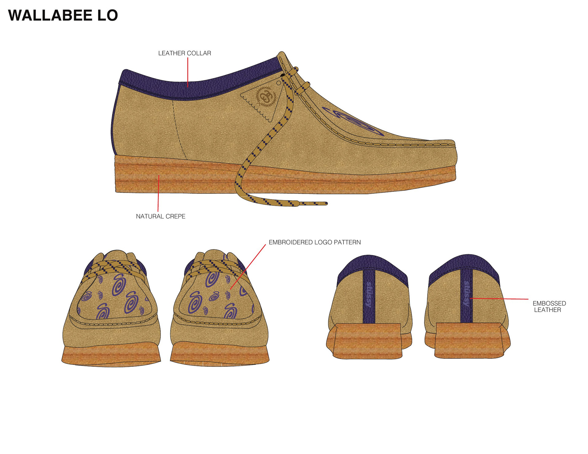
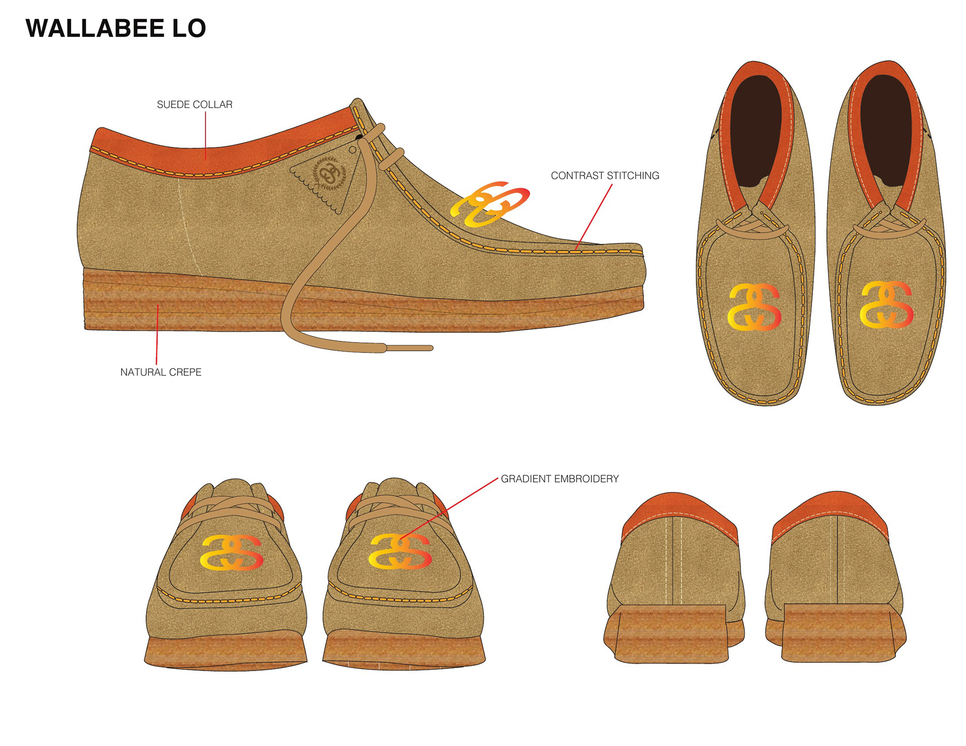
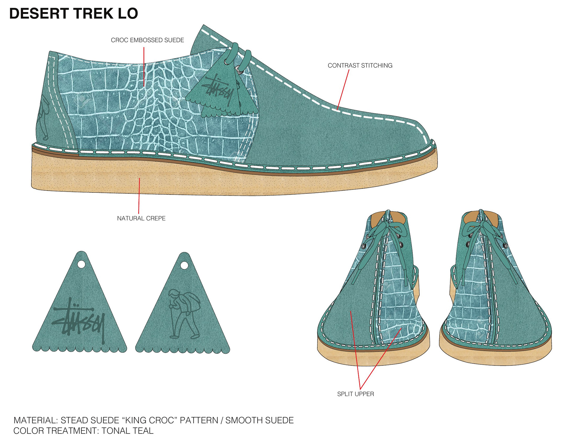
Early exploration across the Wallabee and Desert Trek: embroidery, materials, color, and construction details.
Narrowing the Direction
Through review, the project moved toward the Wallabee.
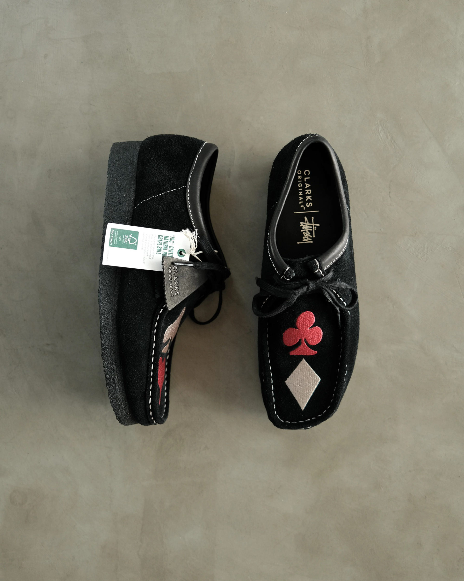
The second round was all Wallabee, built around three graphic ideas: the Stüssy swirl with matching contrast stitching and laces, a single club carrying the Stüssy name, and the four card suits split across the pair. Each one ran through a few different suede colors.
From there, the direction became a single-colorway release built around the card suits. That made the decisions more specific. Instead of designing a small range, the work became about making one Wallabee feel complete from every angle.
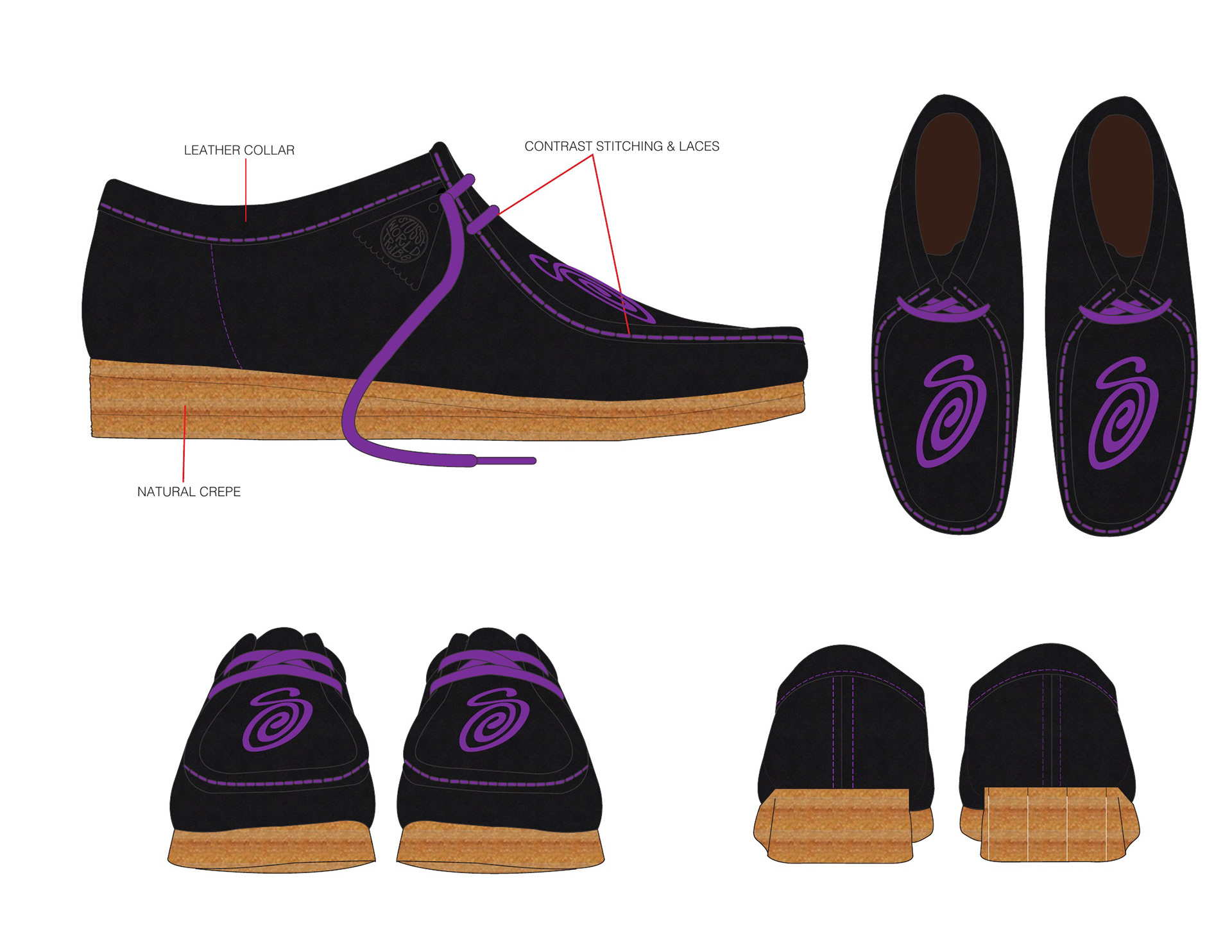
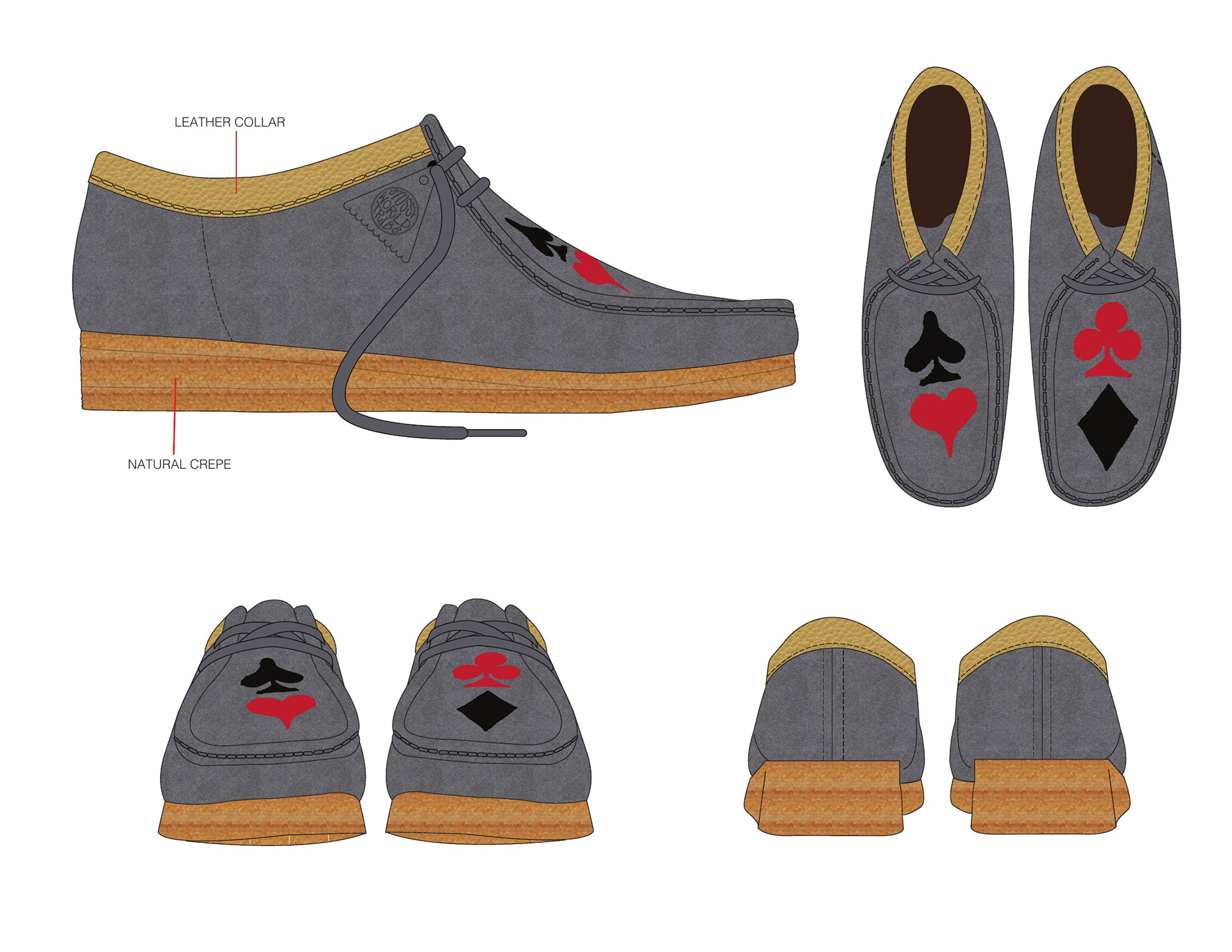
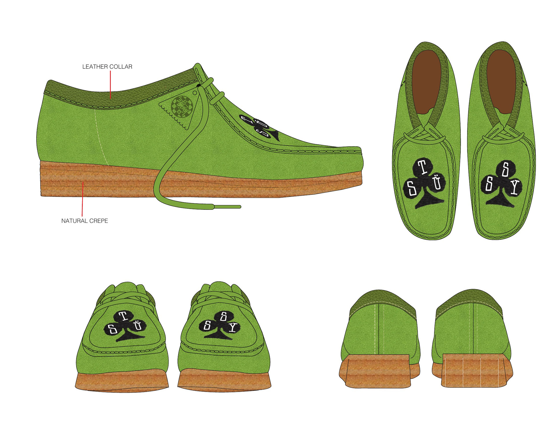
Wallabee development: three graphic directions tested across suede colors before narrowing to the card suits and one final execution.
Building the Final Shoe
The card suits were already part of Stüssy’s visual language. I did not create those marks. My contribution was recognizing that they could give the Wallabee the right Stüssy signal without relying on a large logo across the shoe.
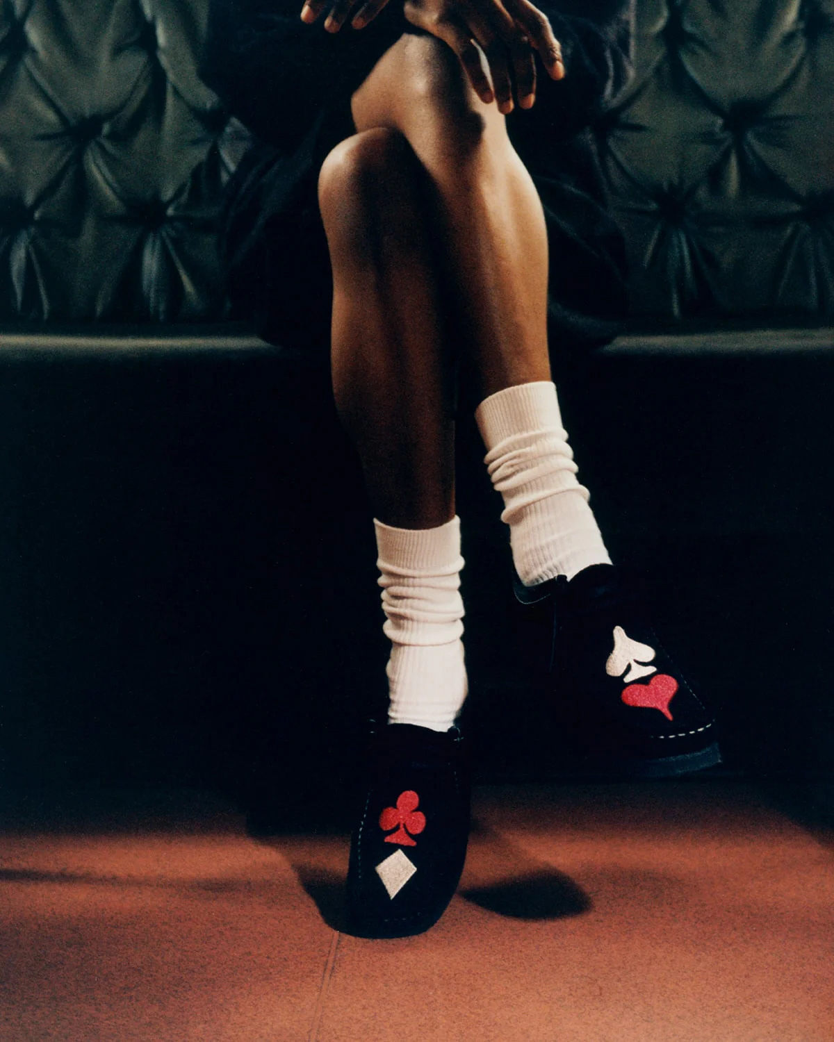
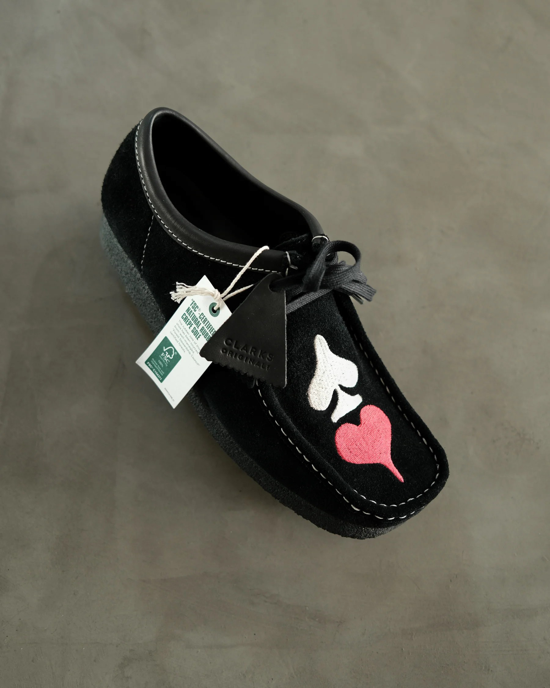
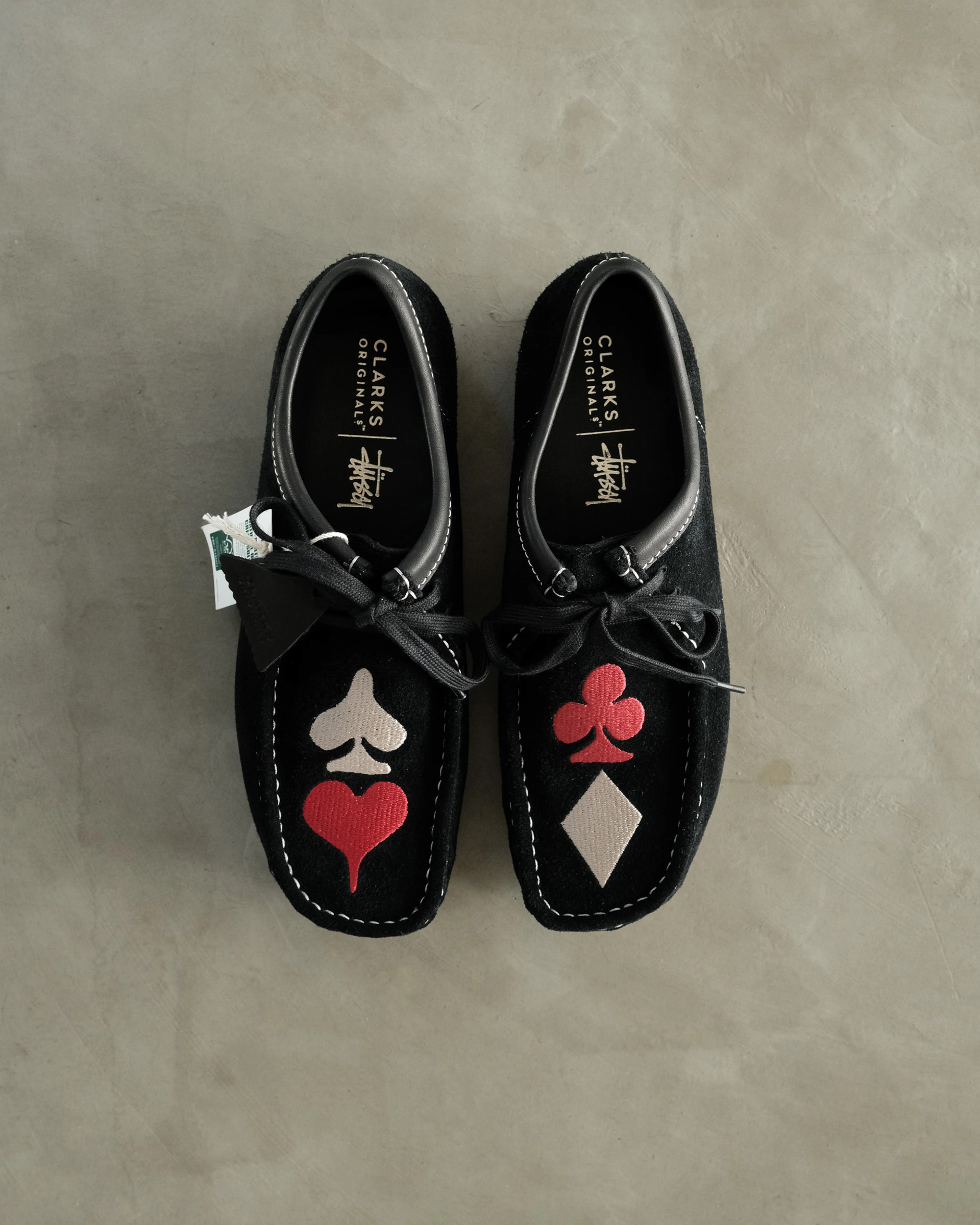
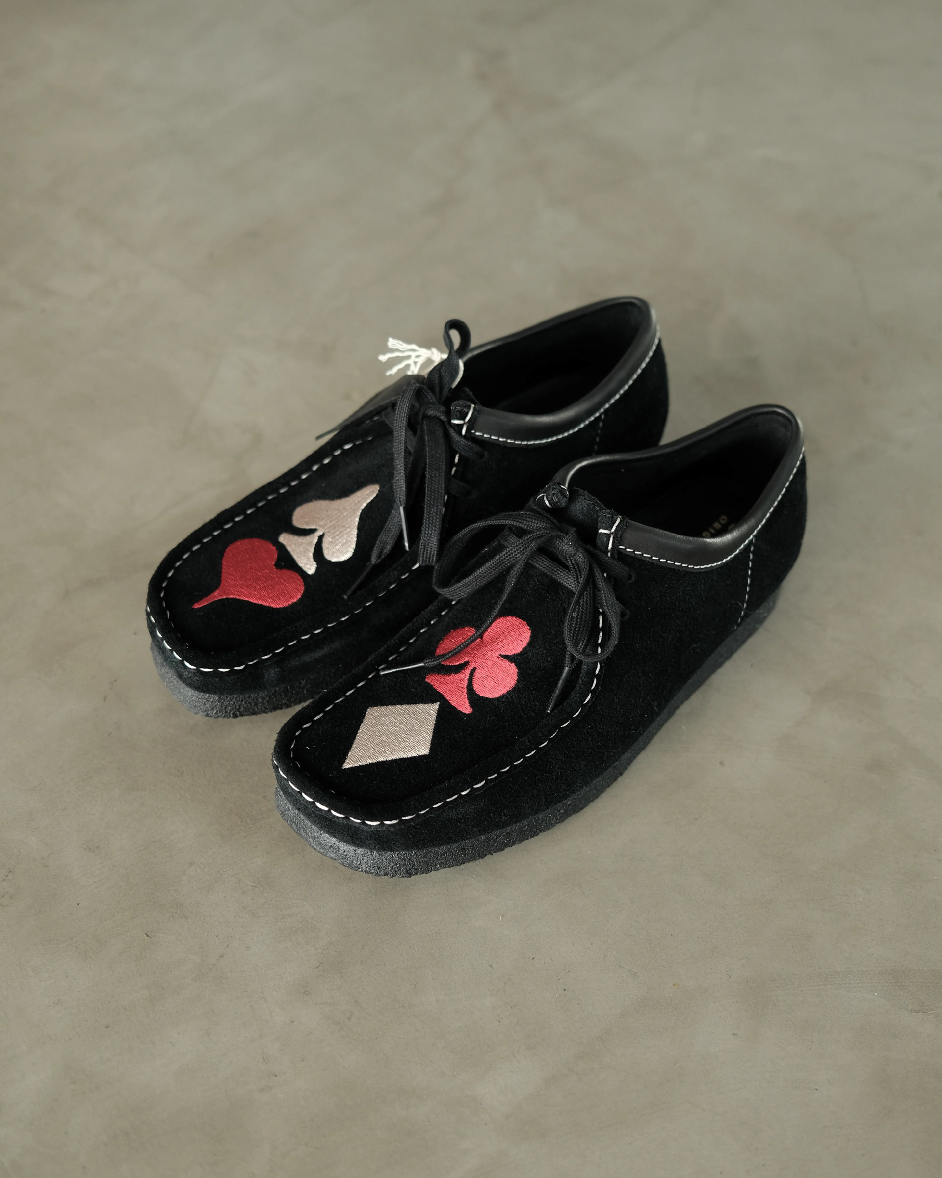
The symbols are familiar almost anywhere, but they also gave the product a direct connection to Stüssy’s own history. The work was in figuring out how they should live on the upper: where they landed, how large they needed to be, and how the embroidery could feel graphic without taking over the entire shoe. They ended up split two per shoe, spade and heart on one, club and diamond on the other, so the full set only comes together as a pair.
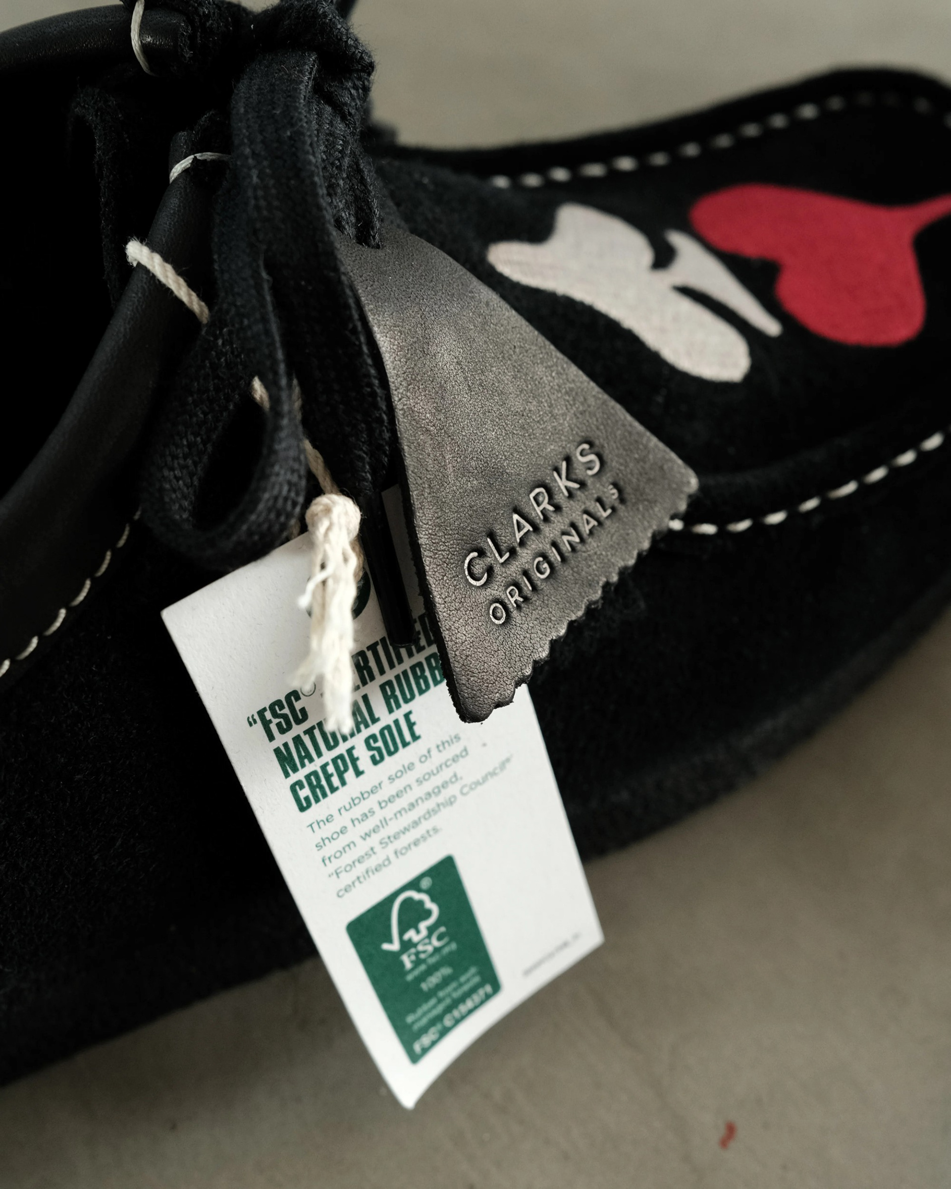
Once the shoe became a single-colorway release, black suede made the most sense. It kept the base clean and gave the embroidery room to hit. The colored symbols are the focal point; the suede, leather collar, laces, and white contrast stitching support them.
The white stitching was important to me because it gives the Wallabee more character and helps define its construction against the black upper. It outlines the recognizable shape of the shoe rather than letting it disappear into one dark surface.
Final Product
The final shoe is an all-black suede Wallabee with a leather collar, white contrast stitching, and oversized embroidered card suits across the pair.
The product is graphic, but it is still wearable. That balance mattered. I wanted it to feel like a shoe people would actually want to put on, not just a collaboration built around a visual idea.
In Market
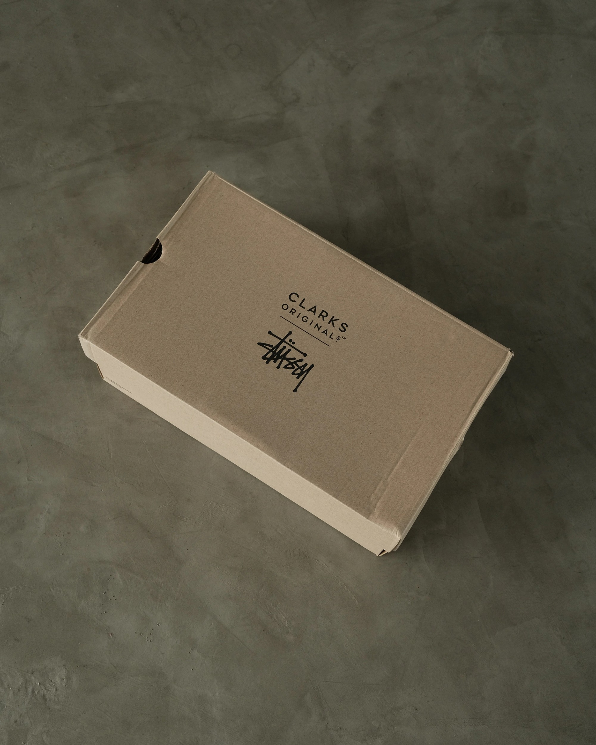
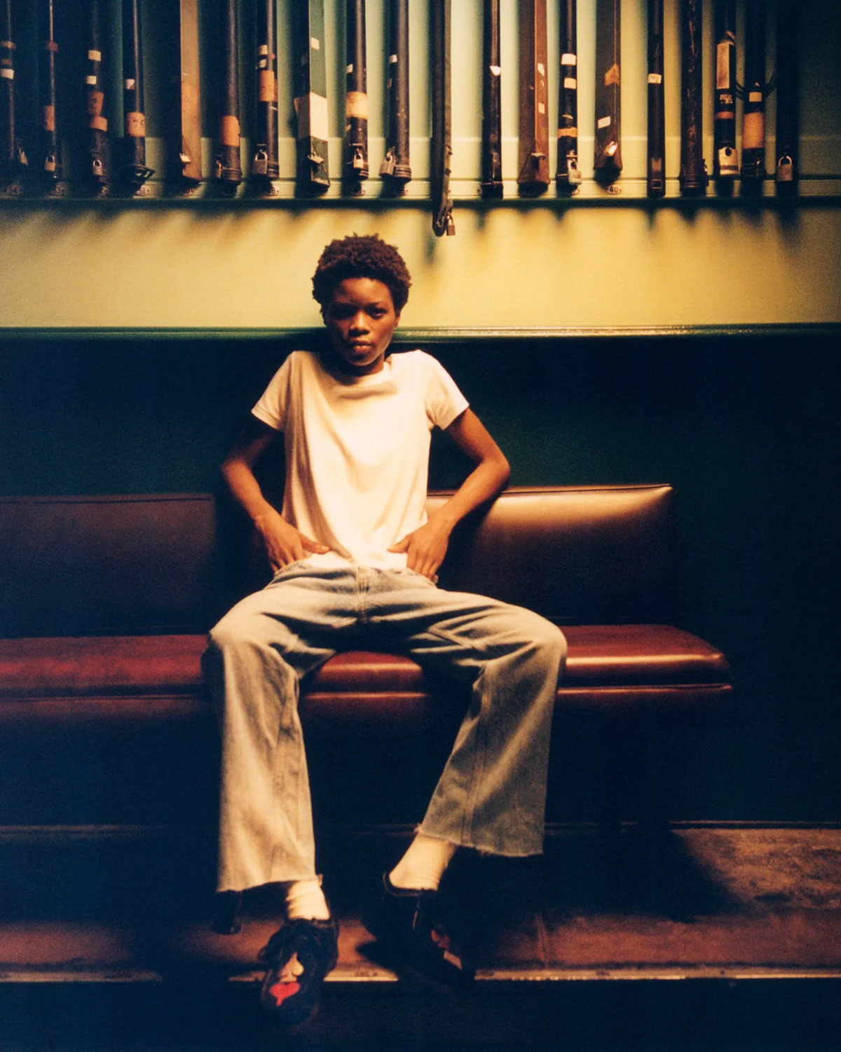
Stüssy presented the finished Wallabee through a campaign photographed by Francis Plummer. The two campaign images on this page, the opening image and the seated portrait, come from that shoot.
The campaign shows the product being worn, which is where the shoe needed to land. The embroidery reads clearly on foot, while the black suede Wallabee still works as an everyday shoe.
Campaign Photography: Francis Plummer · Styling: Jyrrel Roberts
Outcome
The Stüssy × Clarks Originals Wallabee released in September 2023 and sold out on release day.
For me, the project was an important step outside the in-house environment I had spent years working in. It showed that I could come into another established brand’s world, do the research, understand what already belongs there, and make product that feels right for that brand without forcing my own signature onto it.
That is how I like to work: understand the product, understand the brand, make something people want to wear.